How "positive" and "energetic" are The Beatles songs?
Interactive visualization of energy, positivity and more from Spotify API data
So I have been going through one of those phases where I revisit the music of The Beatles (partly driven by the release of their new song Now and Then last year). It made me reflect on the enduring quality of their music and how varied the emotions are in their song catalogue.
Knowing that the Spotify API provides some attributes regarding each song I decided to do a quick analysis of the songs of The Beatles.
What I used
- Python in Visual Studio for extraction and analysis
- Spotify API for extraction of the albums, songs and their audio features
- Plotly package for interactive visualisation
Data extraction
To extract the data, I needed to first be able to use the Spotify API. For this I followed their API documentation details, created a web app and got the client_ID, client_secret and access token.
Then I made a call to their album endpoint for the specific artist_id in Spotify, which for The Beatles can be found online.
Now I also wanted to know what sort of audio attributes were available with Spotify that I could extract. And based on their documentation, here are some select ones that I thought were interesting.
UPDATE: Sadly, in November 2024, Spotify deprecated access to these audio features, along with a few other endpoints. This analysis was done before that, so if you trying a similar project for yourself today, this may not be possible. But I am leaving it here for reference.
-
Tempo: Beats per minute (BPM). This is like the speed of the track, as an average of the beat duration.
-
Key: As per the standard Pitch Class notation. E.g. 0 = C, 1 = C♯/D♭, 2 = D, and so on. -1 if no key was detected.
-
Mode: Whether it is a major (1) or minor (0) scale.
-
Energy: Exactly what it seems like - a measure from 0.0 to 1.0 of the perceived intensity and activity. E.g., death metal has high energy, while a Bach prelude scores low on the scale.
-
Loudness: In decibels (dB), these are averaged across the entire track. Correlates strongly to amplitude and values typically range between -60 and 0 db.
-
Valence: This is an important one as it describes the musical positiveness from 0.0 (more negative, sad, depressed) to 1.0 (more positive, cheerful, happy etc.)
-
Danceability: Describes how suitable a track is for dancing based on a combination of musical elements including tempo, rhythm stability, beat strength, and overall regularity. 0.0 is least danceable and 1.0 is most danceable. This might see high correlations with Tempo, Energy and Loudness, maybe even Valence.
After these were extracted, I stored them in a csv file because I didn’t want to run the API call every time I executed the code notebook.
Analysis
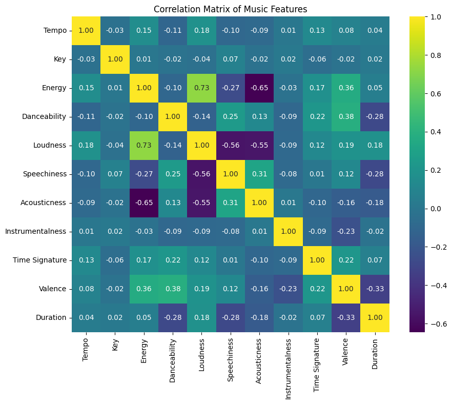
After retrieving the data from the csv file for analysis, my first instinct was to see if all of the select audio features were equally relevant for analysis. I assumed that there would be some correlation between something like Loudness and Energy, which would mean one of them was redundant.

Interestingly the only significant correlation is between Energy and Loudness which makes sense. A somewhat significant inverse correlation between Energy and Acousticness is also expected, as acoustic versions tend to be calmer and quieter. Similarly, the more “speechy” a song, the less loud it tends to be.
Then I tried to see how some of the audio features may have evolved over their entire career. I chose Tempo first but then soon realised (with shame) that this was not interesting since the songs were not released continuously but rather as albums, which meant that the plot would be crowded for one year, then more dots again crowded for the next album release a few years later and so on. Also, the band broke up in 1974 so everything after that was either a rerelease, remastered or live compilations and so on.
So I filtered the dataset for songs before the breakup.
(This is an interactive map, hover over the circles to see more details on each song)
At this point, I also noticed that there were some repetitions. It seems like the Super Deluxe version contains multiple takes, instrumental versions and the 2 singles Penny Lane and Strawberry Fields Forever, along with their different takes. The same goes for the Deluxe Edition. This might be too much redundancy. So I just picked the 2 singles Strawberry Fields Forever - Stereo Mix 2015 and Penny Lane - Stereo Mix 2017 and add to the Remastered dataframe and work with this dataset.
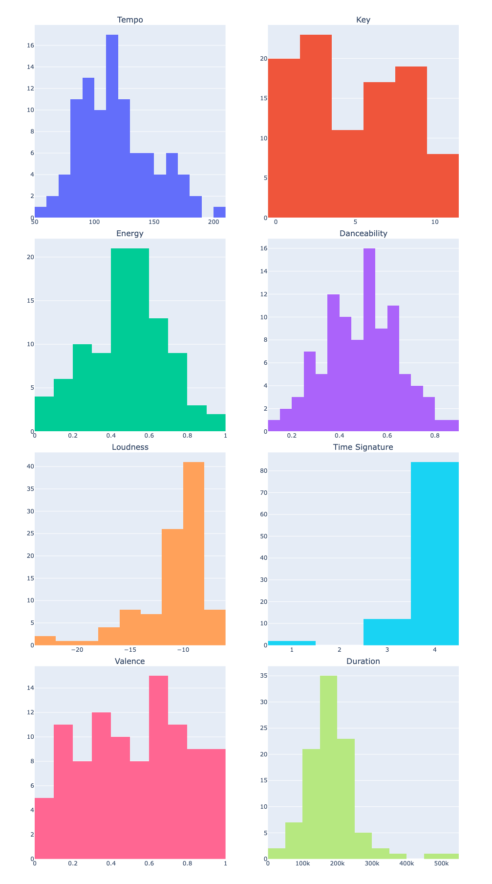
First I want to explore how some of the important audio features are distributed. Among the ones I listed above, I am removing
-
Liveness (because we assume most of these tracks are from their studio albums)
-
Speechiness (because the songs did not have poetry or spoken words other than the lyrics which were generally evenly distributed throughout the songs)
-
Instrumentalness (because most of their tracks contained vocals so this is not so interesting to explore)
-
Acousticness (because this would also be generally even distribution as their songs contained a mixture of acoustic and other new sounds)

The distributions show that the Tempo, Key, Energy, Danceability and Valence are somewhat normally distributed with some double peaks. Songs are generally on the louder side and between 100-200 seconds (approx.1.5 to 3 minutes).
And finally I wanted to get a look of how the songs are placed in relation to Tempo, Duration, Energy and Positivity. It was sort of motivated by thinking of whether longer songs with high tempo and energy are always positive or if sad songs can also be of the same style. Mind you, you can play around with all the different audio features to plot similar graphs but this one seemed most interesting to me.
(This is an interactive map, hover over the circles to see more details on each song)
Some observations from this plot that stand out:
-
Revolution 9 is the longest and is quite energetic but strangely, it shows as on the postive side. But in some sense the song is a bit hopeful (”Don’t you know it’s gonna be…all right!”)and full of warnings (”If you go carrying pictures of Chairman Mao”)
-
I was surprised to see Come Together, A Day in the Life and Magical Mystery Tour on the higher end of Tempo, but maybe I don’t have the musical ability to grasp tempo.
-
Back in The U.S.S.R, Helter Skelter and Sgt. Pepper’s Reprise are high on energy - makes sense, they’re awesome. Golden Slumbers, Julia and Blackbird are some of the low energy songs but they’re awesome too.
-
Helter Skelter and Come Together are also high on positivity while not so positive are A Day in the Life (which makes sense – “He blew his mind out in a car”), Let It Be (”…times of trouble…”) and Sgt. Pepper’s Lonely Hearts Club Band among others.
-
Surprised that Ob-La-Di, Ob-La-Da is not positive because I always found that song to be cheerful.